When designing a modern kitchen, most homeowners think colour is just about “what looks good.”
But as a top interior designer in Mumbai, I’ve learned through hands-on project experience that the right kitchen colour is not just visual, it’s deeply functional, cultural, and emotional.
Especially in Indian homes, where kitchens are used extensively, colour choices directly affect:
- Perceived space
- Maintenance
- Mood
- Longevity of design
In this blog, I’ll break down what truly works (and what doesn’t), based on real design experience.
1. The Biggest Mistake Homeowners Make
One of the most common mistakes I see is:
Choosing dark colours for the entire kitchen.
While dark tones like black, deep brown, or charcoal look premium on Pinterest, they often don’t work well in real Indian homes.
Why?
- They make small kitchens feel even smaller
- Show dust, oil, and fingerprints easily
- Require perfect lighting (which most homes lack)
Instead of avoiding dark colours completely, I recommend:
Using them strategically as accents, not as the base.
2. My Core Approach to Kitchen Colours
In every project, I follow one simple principle:
“Balance aesthetics with everyday usability.”
A kitchen should:
- Look modern
- Feel open and breathable
- Be easy to maintain
That’s why most of my designs focus on:
- Light base colours
- Warm neutrals
- Controlled contrast
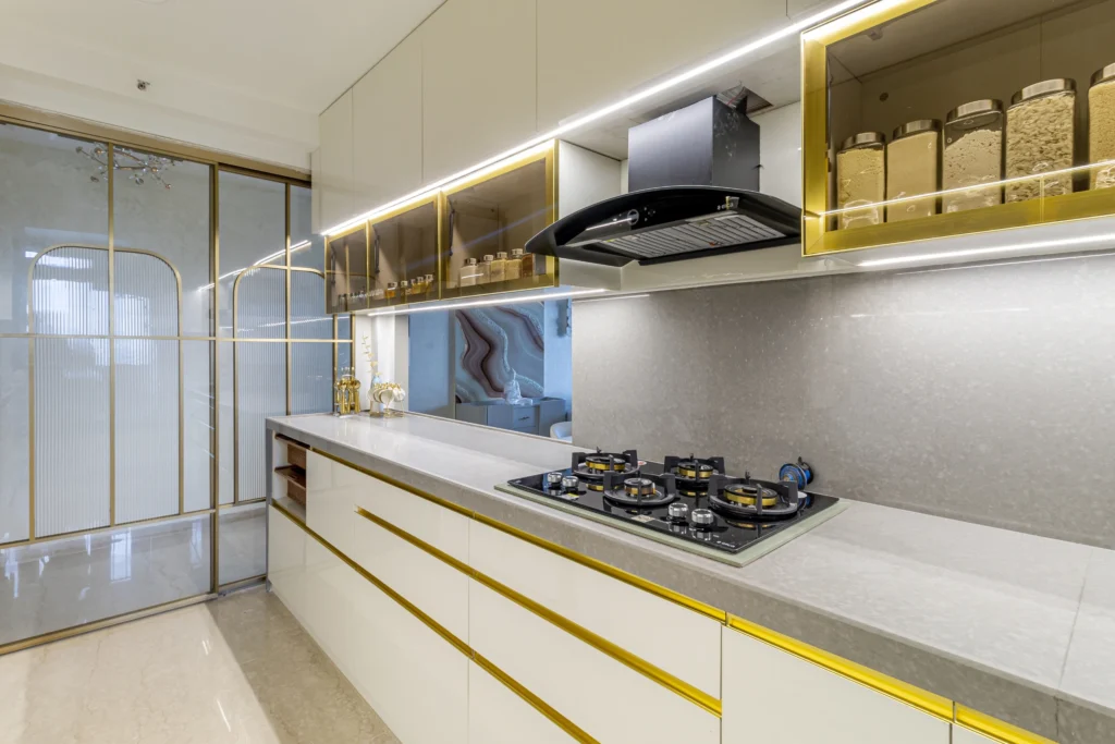
3. Colours That Work Best in Modern Kitchens
1. Whites & Off-Whites (The Evergreen Choice)
White kitchens are timeless, but the trick is choosing the right white.
Best options:
These tones:
- Reflect light beautifully
- Make small kitchens feel bigger
- Pair easily with any material
Ideal for: Compact apartments and budget renovations
2. Beige + Wood (Warm Modern Look)
This is one of my most recommended combinations.
- Beige cabinets
- Wooden textures (laminates or veneers)
It creates:
- A soft, welcoming feel
- A modern yet homely aesthetic
This works especially well in Indian homes where we want warmth, not a cold, sterile kitchen.
3. Grey + White (Contemporary Minimal)
For clients who want a sleek, modern look:
- Light grey base
- White countertops or overhead cabinets
This gives:
- A clean, structured appearance
- A subtle premium feel without being overwhelming
4. Pastel Tones (Emerging Trend)
Soft colours like:
- Sage green
- Powder blue
- Dusty pink
are becoming popular in modern kitchens.
Used correctly, they:
- Add personality
- Keep the space light and fresh
Best used in lower cabinets or highlights.
5. Two-Tone Kitchens (Highly Functional & Stylish)
One trend I actively use in projects is:
Light upper cabinets + darker lower cabinets
Why it works:
- Upper area feels open
- Lower cabinets handle wear & tear better